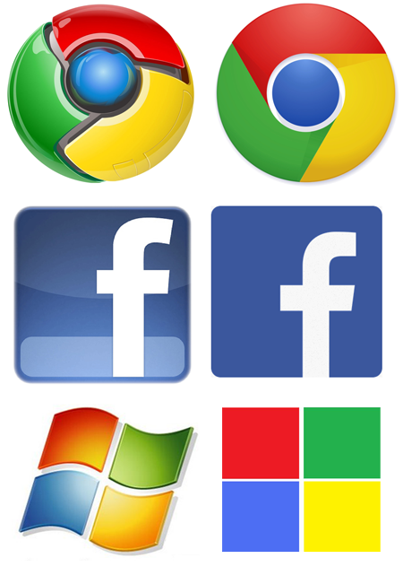
I’ve been recommending my clients flatten their brands over the last several years due to adoption of mobile devices. This is primarily due to people using the devices on the go. If your outside a nice shiny/glassy logo, simply doesn’t render. To the right you’ll see some examples of some major companies adjusting their brands to embrace this change in consumer behavior. This is also to address a growing distaste for Skeumorphism.
Skeumorphism is an interesting concept and has been around for a long time. An example most of us are familiar with is Apple’s love of putting real world textures into their OS. Apparently, this was a love of Steve’s, not Apple’s and the next OS will be “flat + black and white“. I’ll believe it when I see it!
