I’ve been afraid to turn on Tweetdeck lately. (Nope. Not being stalked by a troll. I know. I’m sad about it to.) Over the last month, I’ve been overwhelmed with the amount of valuable infographics. (Don’t believe me? Click here for Twitter/infographic search results.) The left side of my desktop is littered with infographics I’ve found from the Tweeps I follow. I use them in my classes and there are infographics on just about every subject.
I’ve been a fan of infographics since I first saw them. They’re a data visualization method that appeals to right brainers. If CTOs/CFOs like Excel, then CEOs love infographics. Well done infographics make understanding “complex relationships” (No. Not with your Ex), clear and concise. Think of it as the difference between information and communication. (Here’s a great video on infographics.)
Data visualization is a huge deal and can create some amazing graphics. (Google recently acquired a company based on their ability to display data.) VisualComplexity.com has some great examples of data visualization and Visual.ly is a great resource for infographics. (images.google.com works just as well in some cases if you include the term infographic in your search.)
The emergence of infographics tells me several things.
- The Twitter effect is here to say. People don’t have time for spreadsheets. Information must be concise and easy to read.
- There is a ton of data being created. Enough said . . .
- Computing is not for left brainers anymore. iPhones & iPads have the right brainers flocking to technology and they’re pissed about being kept out for so long!
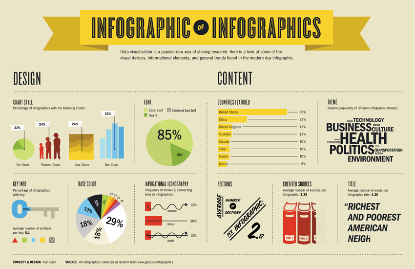
And lastly, this post would be incomplete without a infographic on . . . well . . . inforgraphics.
